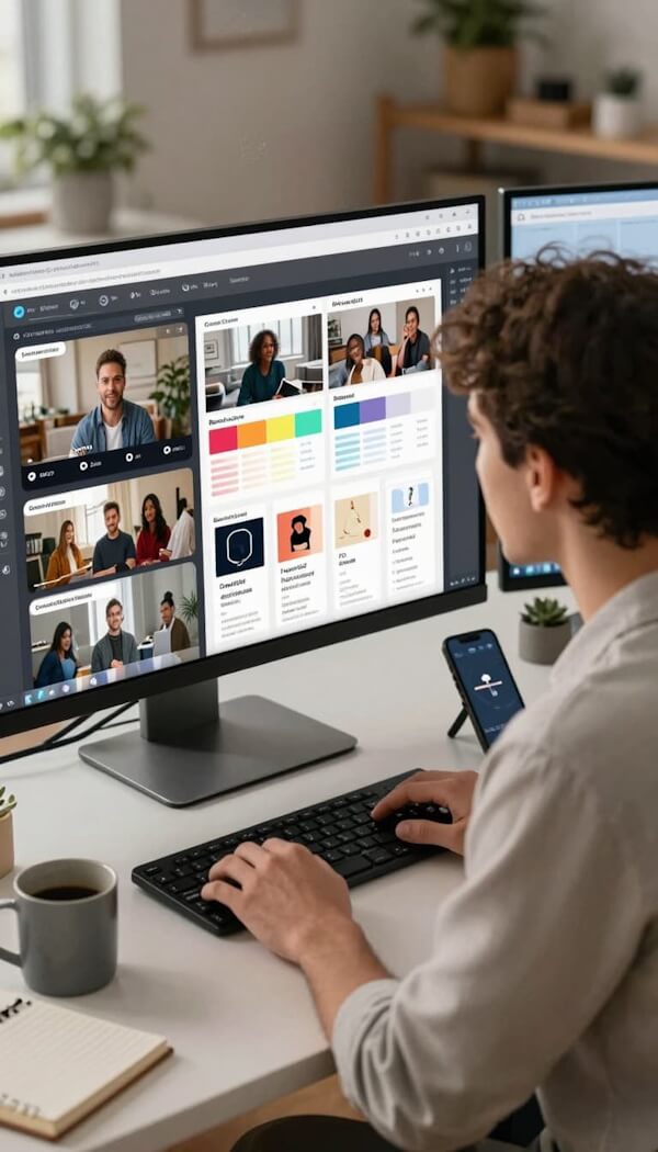
Engaging visuals can show up daily, and your feed can still feel like a ghost town. Pretty stuff isn’t enough; strong visuals (like short videos) make people pause, get your point, and trust you quicker.
In plain language, engaging visuals are images or videos that get attention, feel familiar to the right people, and make the next step obvious (click, save, buy, sign up).
They matter in video marketing because attention is expensive, trust is fragile, and sales usually happen after someone feels both, fueling business growth.
The catch is that visuals should match your target market, not just look “cool.”
Key Takeaways
- Start with the target audience, not the tool.
- Keep it to one message per visual.
- Use contrast and hierarchy so the main point is seen first.
- Stay consistent with brand colors and fonts.
- Add proof with real faces, real product shots, b-roll, and real results.
- Design for the platform, mobile-first, readable fast.
Use light motion and smart AI support in video production, then test variations.
Start with Your Target Market, Not Your Design Tool
Before you open Canva, Photoshop, or your favorite app, run a quick pre-production routine. This is the part most people skip, then wonder why the post “didn’t land.” If your visuals are a joke, the punchline is usually “I designed for me, not them.”
Here’s the repeatable routine:
- Pick one primary audience segment for this visual.
- Name their goal in one sentence.
- Name their biggest worry in one sentence.
- Choose where they’ll see it (platform and placement).
- Decide what action you want right now.
If you do this first, your design decisions get easier. You stop arguing with yourself over fonts at 11:47 PM and start building video content that actually moves people.
If you want a deeper set of guardrails, these video content best practices are a solid companion read.
Build a simple visual profile of your target audience
Keep it simple. You don’t need a 40-slide persona deck. You need a “sticky note profile” from which you can design engaging videos.
Use this format:
- Primary segment: Who is this for?
- Goal: What do they want today?
- Big worry: What might stop them from trusting you?
- Placement: Where will they see it (Instagram feed, email header, YouTube thumbnail, landing page hero)?
Three quick examples:
- Creator: Wants more saves and shares, worries they look amateur, sees it on Instagram and YouTube video thumbnails.
- Local service business: Wants calls or bookings, worries about being compared on price, sees it on Google Business posts, Facebook, and email.
- Ecommerce brand: Wants first-time purchases, worries about quality and shipping, sees it on paid ads, product pages, and Reels.
Match the visual to the job it needs to do
Most visuals have one main job. When you try to give them five jobs, they do none of them well (like an intern asked to run payroll and DJ the holiday party).
Typical “jobs”:
- Stop the scroll
- Explain a concept fast
- Prove results
- Drive a click
- Get a reply (DM, comment, email)
Mini decision guide:
- Awareness: bold, simple, curiosity-forward with a hook
- Consideration: clear steps, proof, comparisons, “here’s how it works”
- Conversion: trust signals (reviews, guarantees), one clear call to action, low friction
This “job first” approach will make every tip below easier to apply.
7 Tips for Creating Engaging Visuals that Grab Attention and Feel on Brand
Tip 1: Lead with one clear idea, then remove the clutter
The fastest way to improve your visuals is the “one message per visual” rule, especially for video content. If your graphic or video content is trying to say:
- sale details
- brand story
- three product features
- your origin story
- and a motivational quote
…your audience will do the only logical thing: keep scrolling.
What to trim first, extra:
- Icons that don’t add meaning
- Fonts (stick to two)
- Lines of text that repeat the headline
Quick before and after (in words):
- Before: A crowded promo graphic with five badges, three fonts, a long paragraph, and “LIMITED TIME” screaming in three corners.
- After: One headline (“Get a 15-minute website video audit”), one supporting line (“See what’s costing you clicks”), one image, one CTA button.
Clear beats clever. Every time.
Tip 2: Use contrast and hierarchy so the main point is seen first
Contrast is what makes the important parts pop. Hierarchy is the order in which your eye reads things. You can create contrasts with:
- Size (big headline, smaller support line)
- Color (one accent color used on purpose)
- Spacing (white space is not “empty,” it’s breathing room)
A simple 3-step layout formula for many social posts and ads:
- Hook headline (3 to 7 words, biggest text)
- Support line (what it is, who it’s for, or why it matters)
- Single action (CTA: “Save this,” “Shop now,” “Get the guide”)
If you’re rusty on the fundamentals, this overview of visual hierarchy examples breaks down how composition guides the viewer’s eye.
Tip 3: Pick colors and fonts that match your brand and your audience’s mood
Color is vibe. Font is voice. When they clash with your audience’s expectations, people feel it (even if they can’t explain it), and your visual storytelling falls flat. A few broad (not overly technical) cues:
- Calm and steady: blues, softer neutrals
- Bold and energetic: bright accents, strong contrast
- Premium: restrained palette, lots of space, fewer elements
- Playful: warmer colors, friendly, rounded type
For video assets, also prioritize audio quality to reinforce the mood. Two practical rules that save time:
- Font pairing: one display font for headlines, one easy-to-read font for everything else.
- Accessibility: avoid low-contrast text. If you have to squint, your audience on a phone definitely does too.
Color “rules” are contextual, not magic spells. This guide on color psychology in marketing does a good job explaining why the same color can feel different depending on context.
Tip 4: Use real faces, real product shots, and proof whenever possible to boost video engagement
People trust people. Faces pull attention because we’re wired that way. If you can swap a generic stock photo for a real face or real product, do it. This kind of authentic storytelling resonates deeply. “Proof visuals” that tend to work across niches:
- Screenshot of results (analytics, bookings, revenue, time saved)
- Short testimonial cards with a name and photo (with permission)
- Before and after images (especially for service businesses)
- Quick stat graphics (one stat, one source, one point)
Two non-negotiables:
- Get permission for testimonials and customer screenshots.
- Don’t make claims you can’t back up. Your audience has been burned before. They’re not in the mood for fairy tales.
For video-based proof and creating engaging videos, these video engagement tips can help you turn “nice video” into “people actually watched it.”
Tip 5: Design for the platform and the scroll
A great design that’s cropped weirdly on mobile becomes a sad design. Most people will see your visual on a phone, in a hurry, with the brightness at 12%. Platform-first basics for social media:
- Make text readable at a glance; add closed captions for video content.
- Keep key info in the center “safe zone.”
- Assume your caption won’t be read.
Examples to design around:
- Instagram/Reels cover: one headline, high contrast, centered. Avoid tiny text near edges.
- YouTube thumbnail/video thumbnails: big face or object, 2 to 5 words max, strong contrast. If it looks fine only when zoomed in, it’s not fine.
- LinkedIn carousel: treat slide one like a billboard, then use clean step-by-step slides after.
- Email header: keep it light, fast-loading, and brand consistent. Use the header to support the subject line, not fight it.
If you’re building a lot of platform-specific visuals, it helps to keep a repeatable template system and then customize the hook for each platform.
Tip 6: Add light motion to boost video engagement without distracting
Motion grabs attention, but too much motion feels like a 2007 pop-up ad. Light motion helps produce high-quality, engaging video. Use light motion when:
- You need a quick pattern interrupt (social)
- You’re showing a process (step 1, step 2, step 3)
- You want a “living” proof piece (testimonial card with subtle movement)
Easy motion ideas:
- Text pop-in on the first keyword
- A simple progress bar for a 3-step tip
- A slow product spin or gentle zoom
Keep movement subtle. Avoid flashing, rapid shakes, or anything that can trigger motion sickness. Your goal is “ooh,” not “I need to lie down.”
If motion is new to you, starting with craft compelling explainer videos can give you a simple structure for visuals, pacing, and clarity.
Tip 7: Use AI to speed up ideas, variations, and testing, but keep the brand voice human
AI can help you move faster, but it can’t care about your audience. That part is still on you. Practical AI uses for engaging visuals:
- Brainstorming concepts and hooks
- Generating layout variations for the same message
- Removing backgrounds and cleaning up photos
- Resizing for different platforms
- Streamlining video editing
- Creating multiple ad variations from one base design
- Turning a long script into short on-screen text
Safe-use checklist:
- Review facts and numbers for accuracy.
- Avoid copyrighted styles and look-alike brand ripoffs.
- Fix weird hands and uncanny faces (we’ve all seen them).
- Keep brand colors and fonts consistent across outputs.
Then test. Run A/B tests with 2 to 3 versions, changing one thing at a time (headline, image, accent color, CTA). If you want more ideas on tools that speed this up for video marketing, this roundup of top AI tools for visual marketing is a handy starting point.
A Simple Workflow to Plan, Create, and Test Visuals Faster (with AI in the Loop)
You don’t need a giant team. You need a small playbook that you actually follow, even on busy weeks. Here’s a weekly video production workflow that fits real life.
- Pick one campaign goal (leads, bookings, product sales, sign-ups).
- Choose one audience segment and one offer.
- Build 3 core messages (pain, promise, proof).
- Create three visual directions for video content (template-based is fine).
- Produce platform versions of the video content (sizes, safe zones, text scale).
- Publish, then review results in 15 minutes.
Quick checklist of tools (keep it simple):
- A design tool (templates, brand kit)
- A photo editor (background removal, cleanup)
- A short-form video editor (captions, quick cuts)
- An AI assistant (hooks, variants, text)
- A scheduler (posting and testing cadence)
If you’re experimenting with synthetic images, this overview of AI-generated visuals in digital marketing helps you understand what’s changing and what to watch out for.
The 30-minute pre-design plan
Set a timer. You’re building clarity, not a masterpiece. Mini checklist you can copy:
- Goal: What should happen after they see this?
- Audience: Who is it for (one segment)?
- One message: What’s the single point?
- Assets: What do I have (photo, product shot, testimonial, stat, video script)?
- Format: Which distribution channels will it live in (Reels cover, thumbnail, email, ad)?
- CTA: One action only
- Deadline: When does it publish?
Do this, then design. You’ll waste less time and make better decisions.
Test what works and track the right signals
Different platforms reward different behavior. Match your measurement to the job for strong video engagement.
- Short video: thumb-stop rate, watch time, completion rate
- Ads: click-through rate, cost per click, conversions
- Social posts: saves, shares, profile taps
- Landing pages: conversions and scroll depth (if you track it)
- Email: clicks on the main button, not just opens
Test one change at a time. If you change the headline, colors, photo, and CTA all at once, you won’t know what helped.
FAQ for Creating Engaging Visuals
What makes visuals engaging?
Engaging visuals, including engaging videos, stop the scroll, feel relevant to the viewer, and communicate fast. Strong contrast, clear hierarchy, and one obvious message usually beat complex designs.
How do I know if a visual is working?
Look for behavior, not compliments. Saves, shares, clicks, watch time, and conversions are stronger signals than “love this!” comments.
What are common mistakes marketers make with visuals?
Too much text, too many fonts, low contrast, and unclear CTAs in video content. Another big one is designing for personal taste instead of the target market’s expectations.
How can AI help without making content feel generic?
Use AI for speed (variants, cleanup, resizing, video script ideas, AI avatars), then apply your brand rules and your audience insights. Keep your voice, your proof, and your real stories in the final version.
What file types and sizes should I use?
Use PNG for graphics with text, JPG for photos, and MP4 for video. Export at the platform’s recommended sizes and always preview on a phone before posting to meet accessibility standards.
How often should I refresh creatives?
When performance drops or your offer changes. For ads, many brands refresh every 2 to 4 weeks, and sooner if frequency climbs and results slide.
Final Thoughts About Engaging Visuals
Your next batch of engaging videos doesn’t need to be “more creative” or just pretty but ineffective graphics. It requires professional videos that are clearer, better matched to the audience through storytelling and emotional connection, and easier to act on.
Pick one tip from this post and use it today, even if it’s just removing clutter or fixing contrast.
A simple next step: audit your last 10 pieces of video content for clarity, contrast, and audience fit. Keep what works, fix what doesn’t, and let results pick the winner. This will boost your video SEO while encouraging further exploration of these advanced concepts.
Originally published October 26, 2023; Republished December 25, 2025, to update content and add video.

As a Visual Digital Marketing Specialist for New Horizons 123, Julie works to grow small businesses, increasing their online visibility by leveraging the latest in internet and video technologies. She specializes in creative camera-less animated video production, custom images, content writing, and SlideShare presentations. Julie also manages content, blog management, email marketing, marketing automation, and social media for her clients.


0 Comments